


Galactic Goods
FlexCore Resistance Rope 💪
FlexCore Resistance Rope 💪
Couldn't load pickup availability
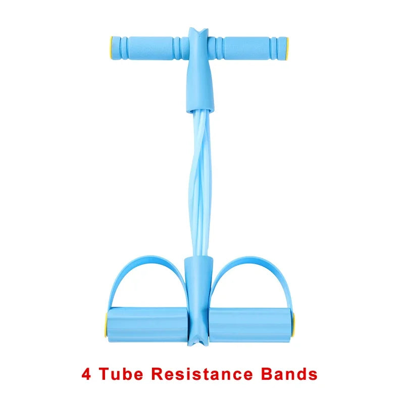
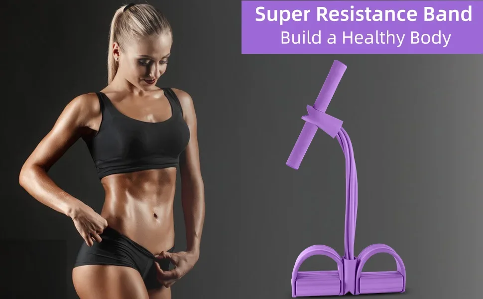
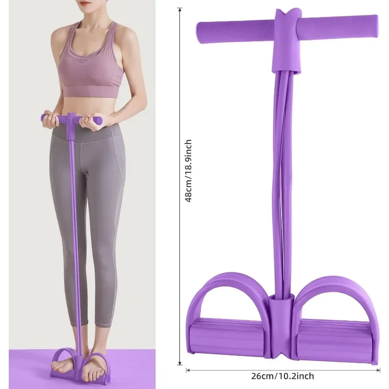
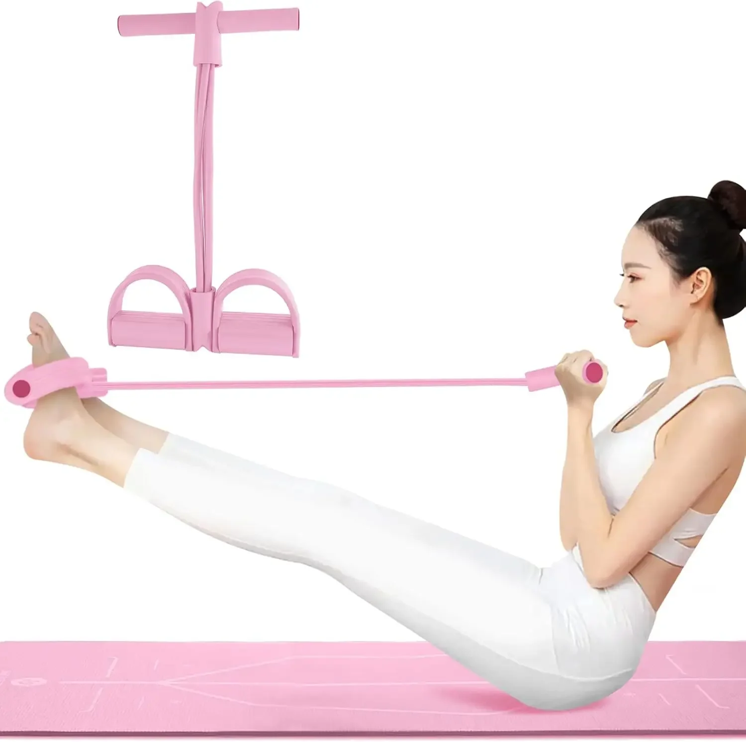
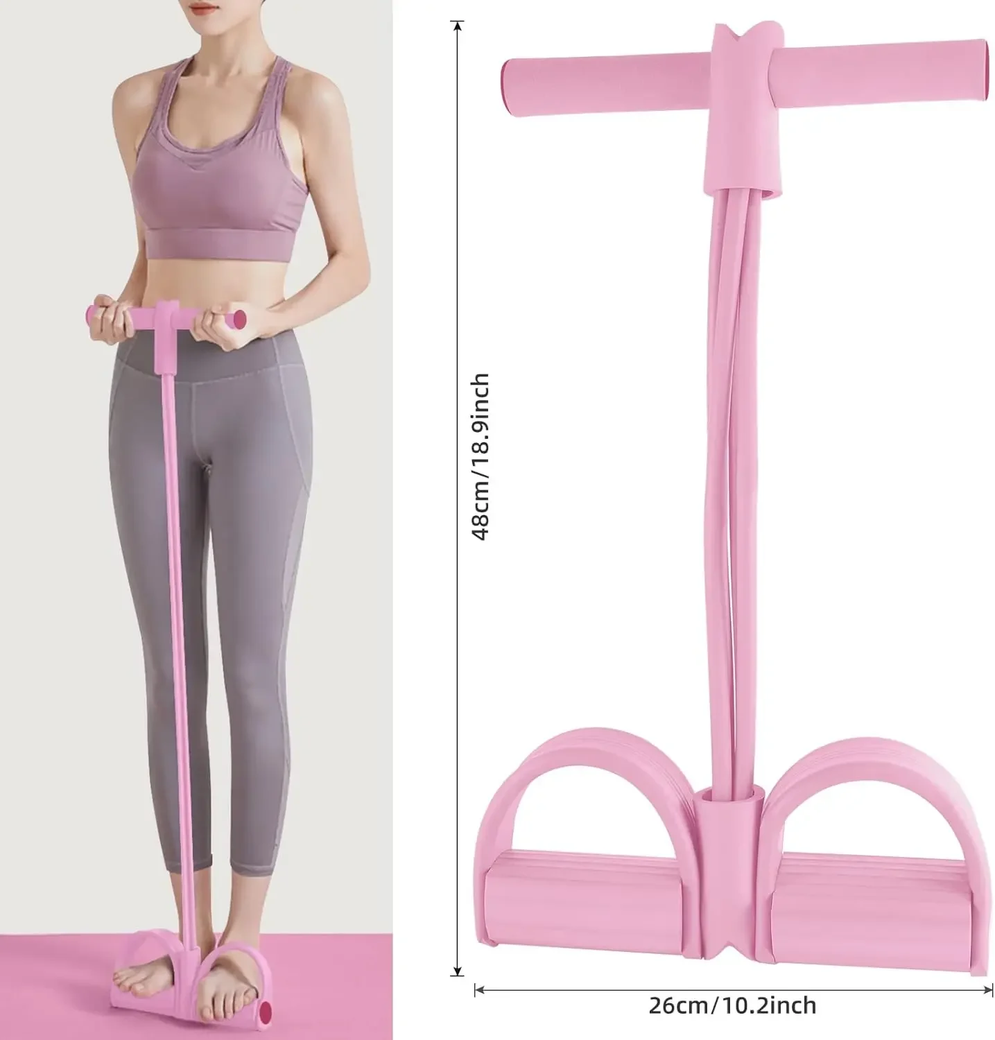
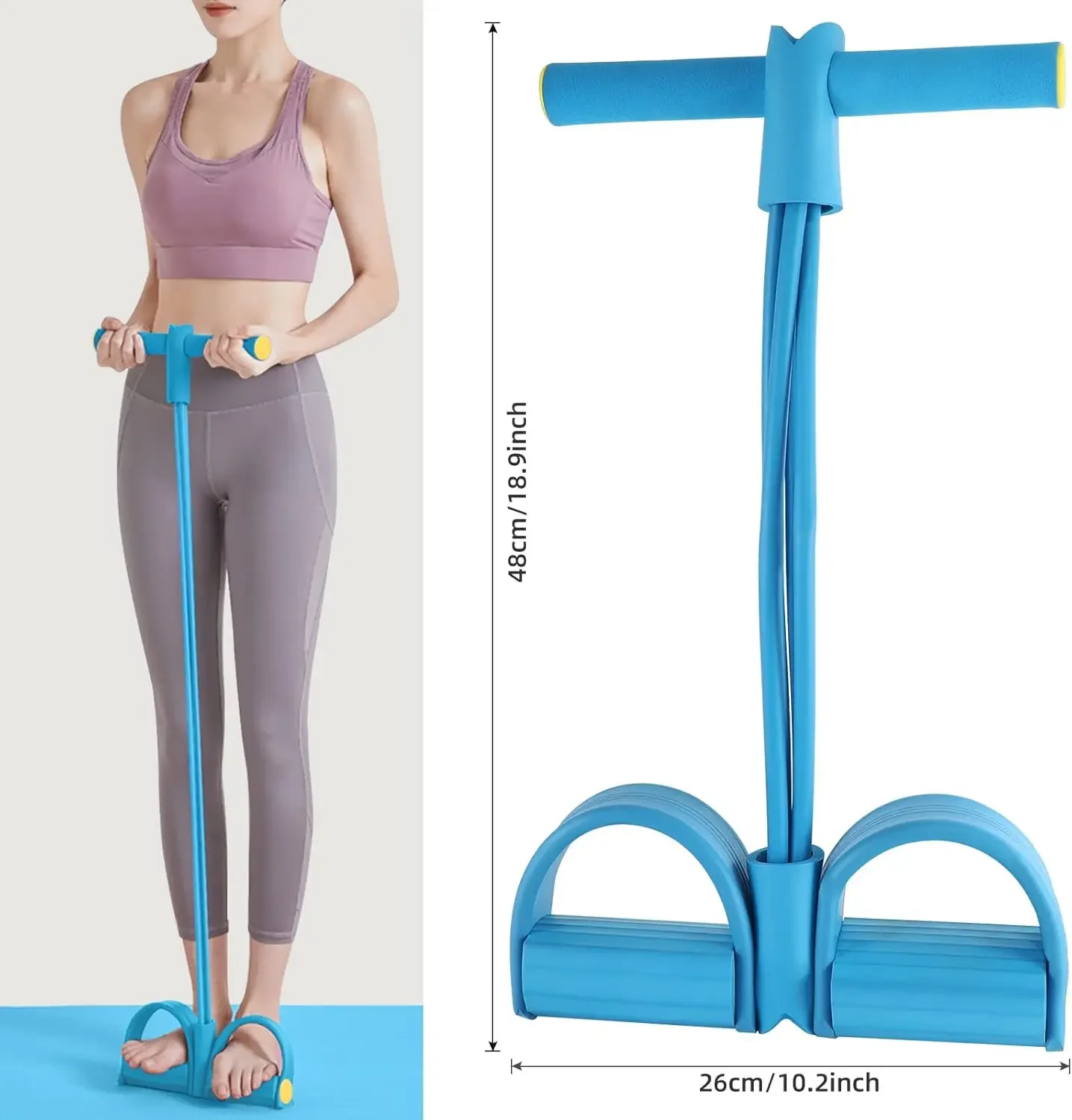
FlexCore Resistance Rope Set – 💪 Portable Full Body Workout Trainer
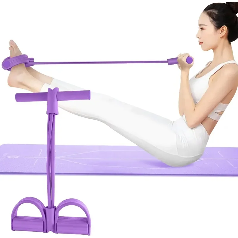
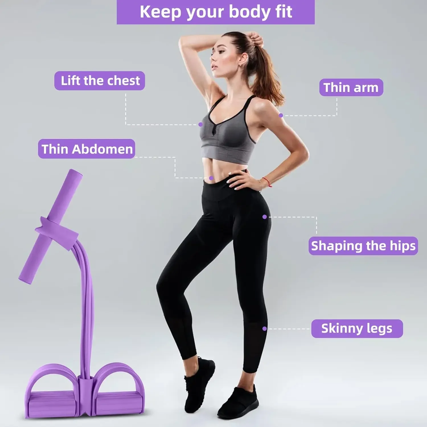
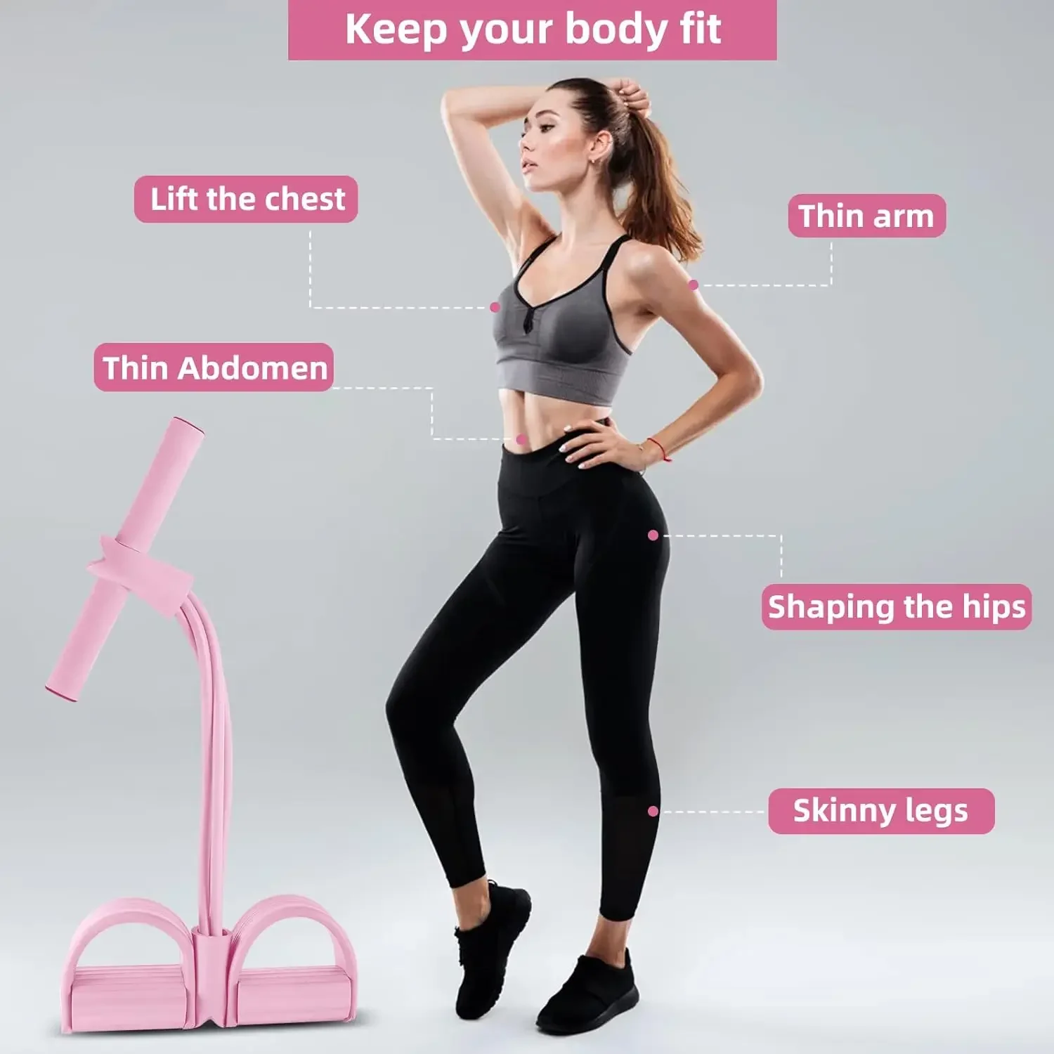
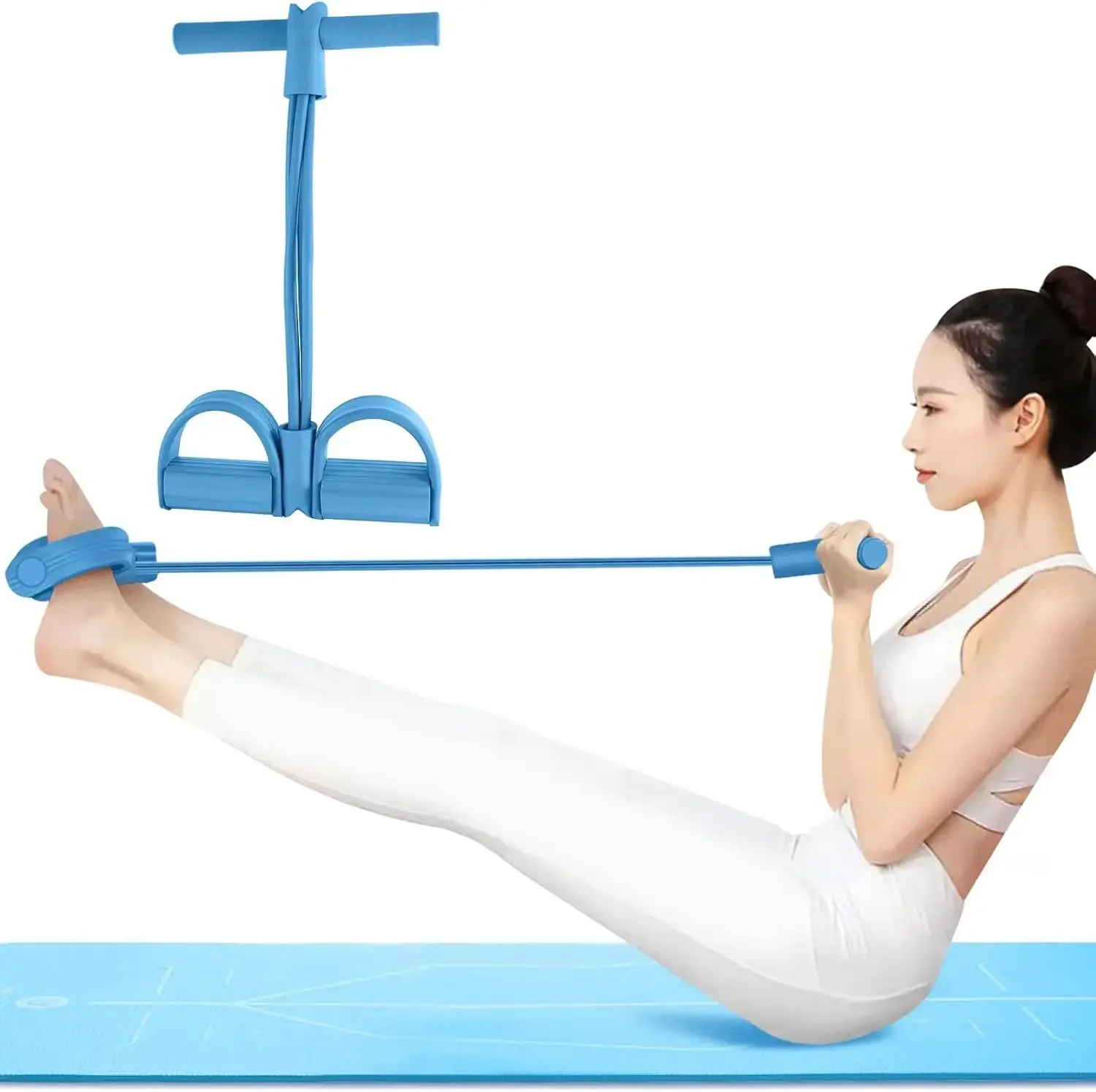
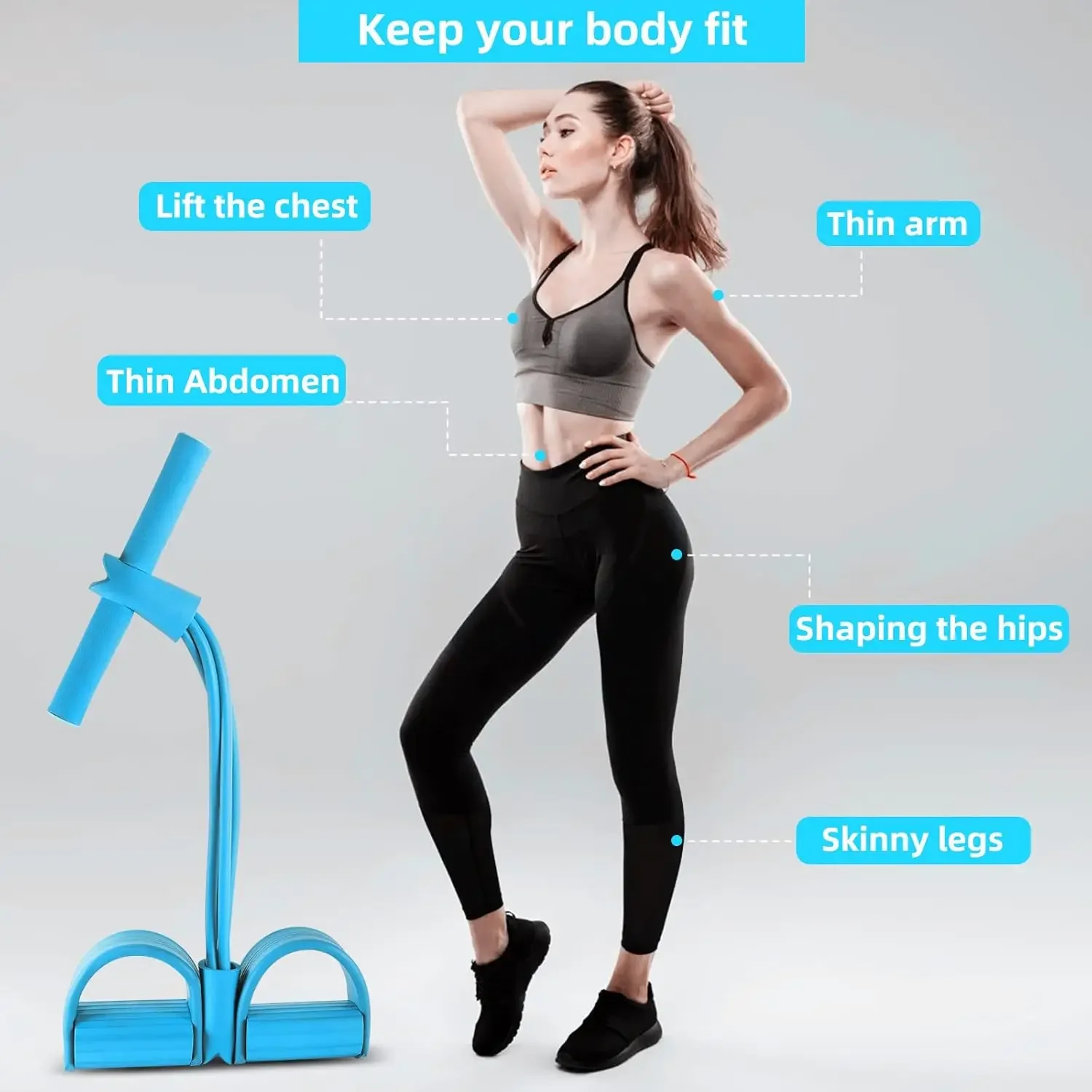
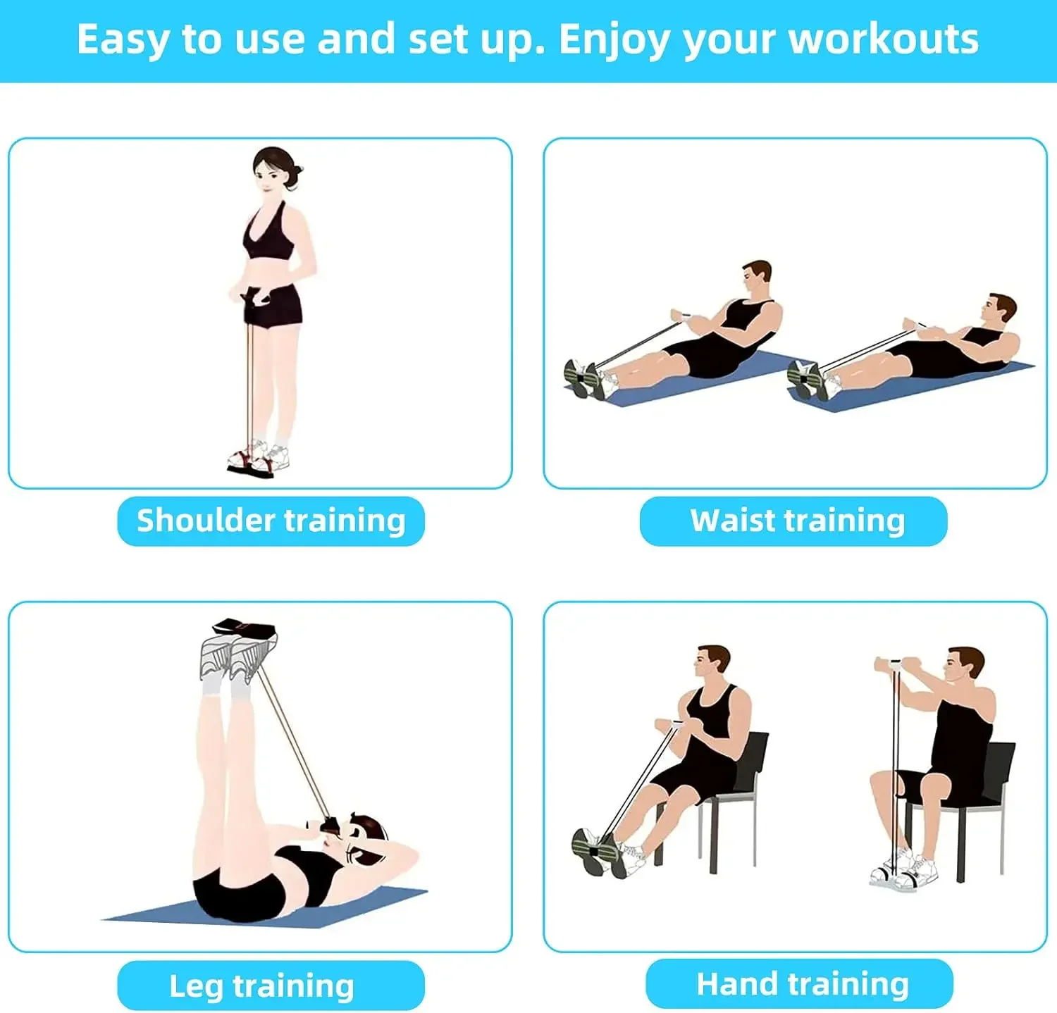
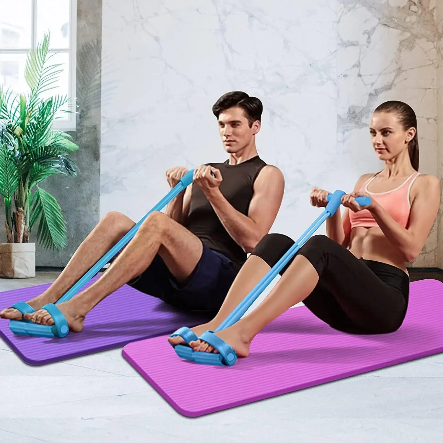
Build strength, tone muscles, and enhance your workouts from virtually anywhere with the FlexCore Resistance Rope Set. Designed for full-body training, this compact fitness tool combines durable latex resistance tubes, comfortable foot pedals, and ergonomic handles to help you target your core, arms, legs, back, and glutes—all without the need for bulky gym equipment.
Available in 4-Tube and 6-Tube versions, you can choose the resistance level that best matches your fitness goals.
Features
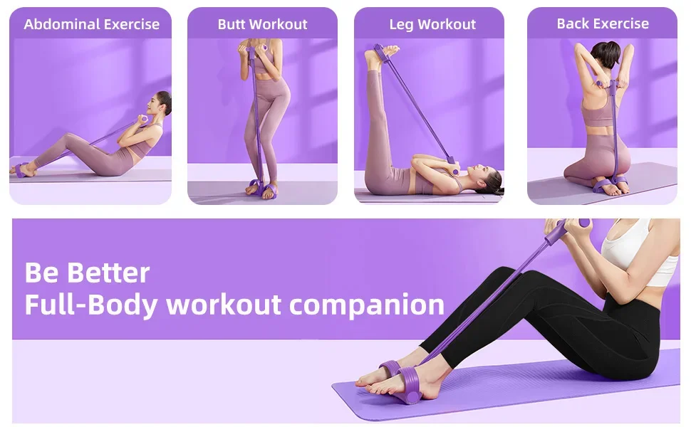
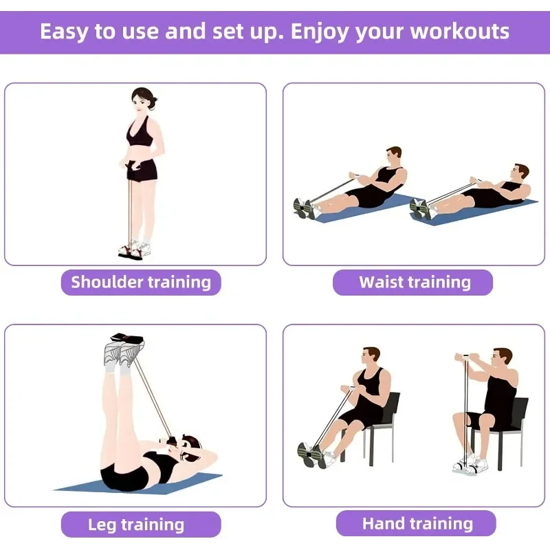
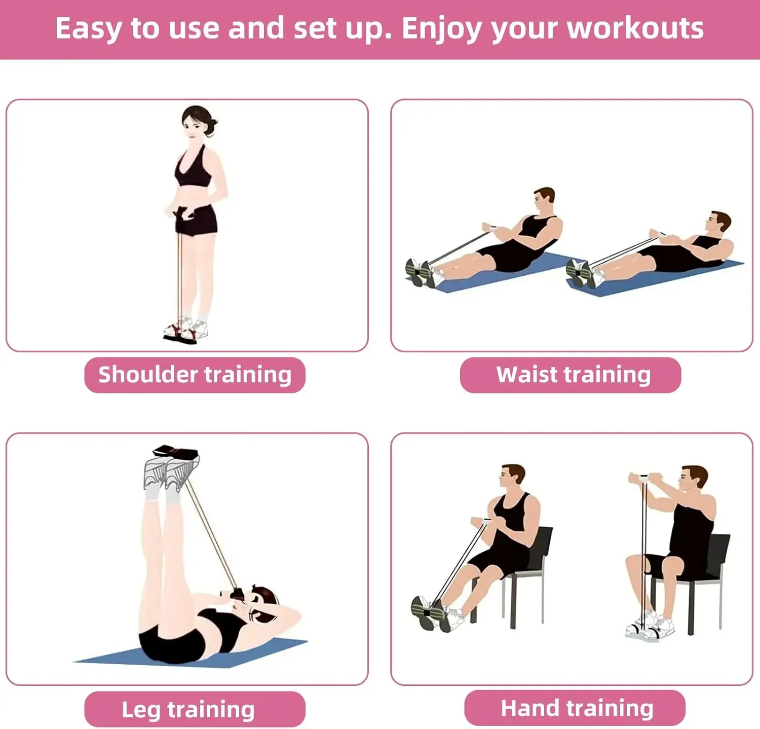
✅ Full-body resistance training for home, gym, office, or travel
✅ Available in 2 resistance options:
- 4-Tube Version – Great for beginners and moderate workouts
- 6-Tube Version – Increased resistance for more challenging training sessions
✅ Helps strengthen abs, arms, shoulders, chest, back, legs, and glutes
✅ Ideal for sit-ups, stretching, strength training, toning, and rehabilitation exercises
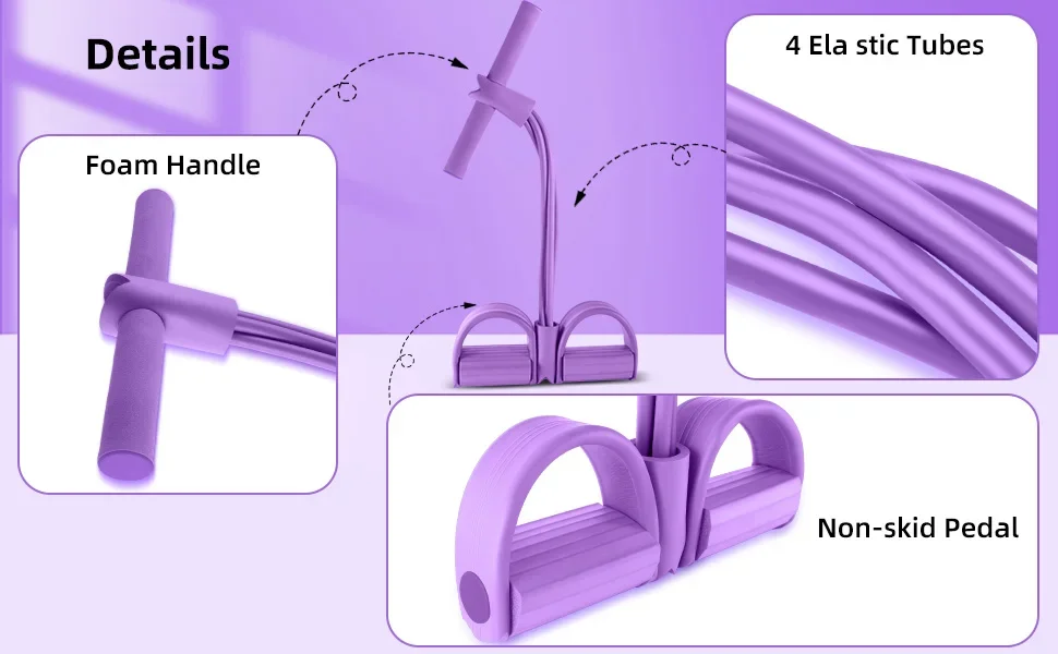
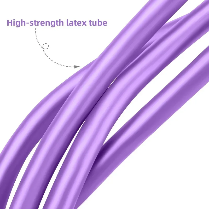
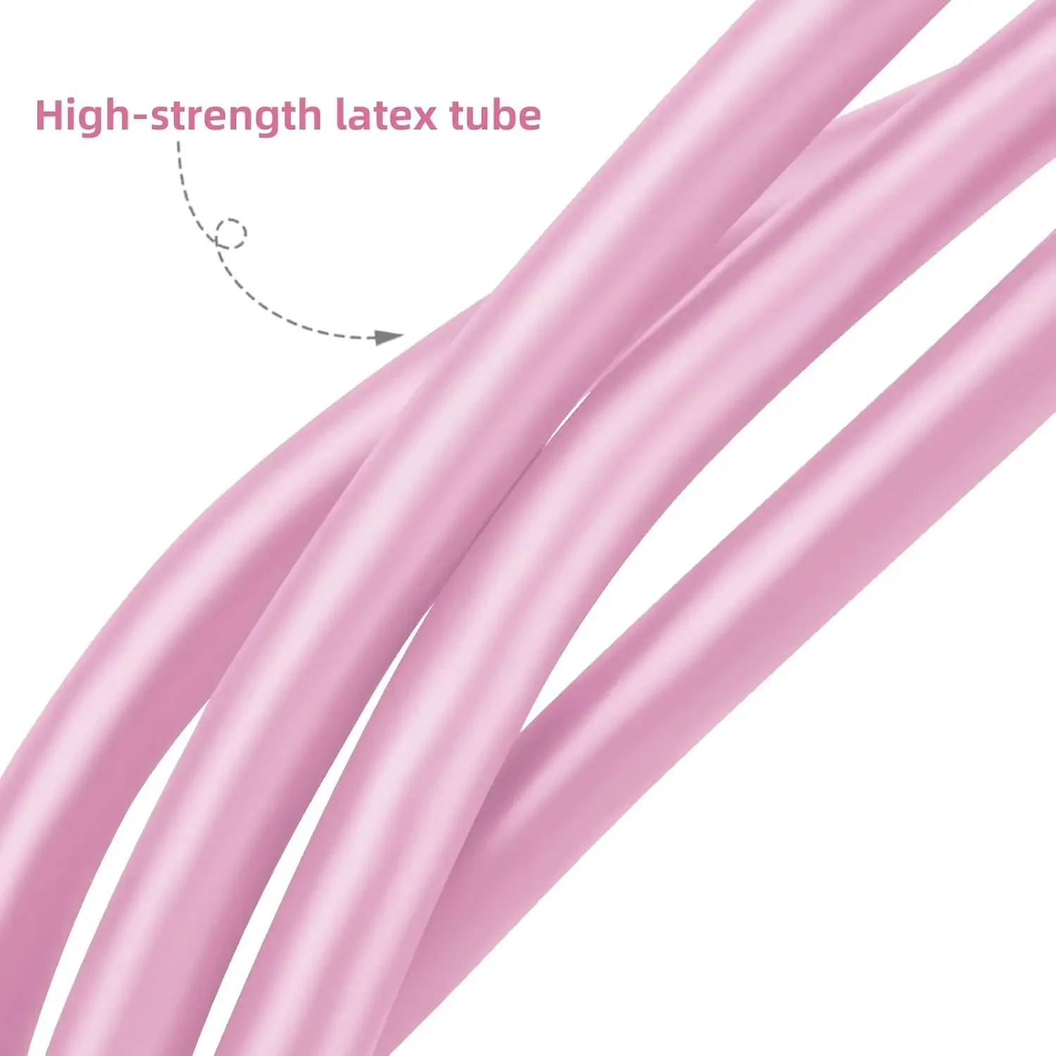
✅ Durable high-elasticity latex tubes provide smooth and consistent resistance
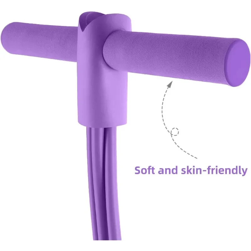
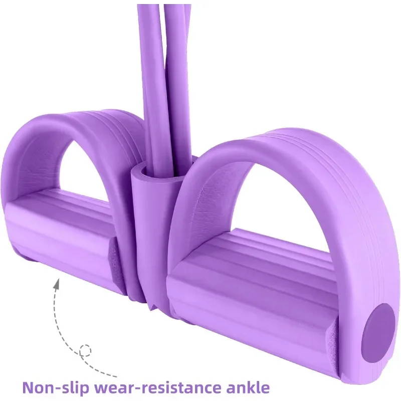
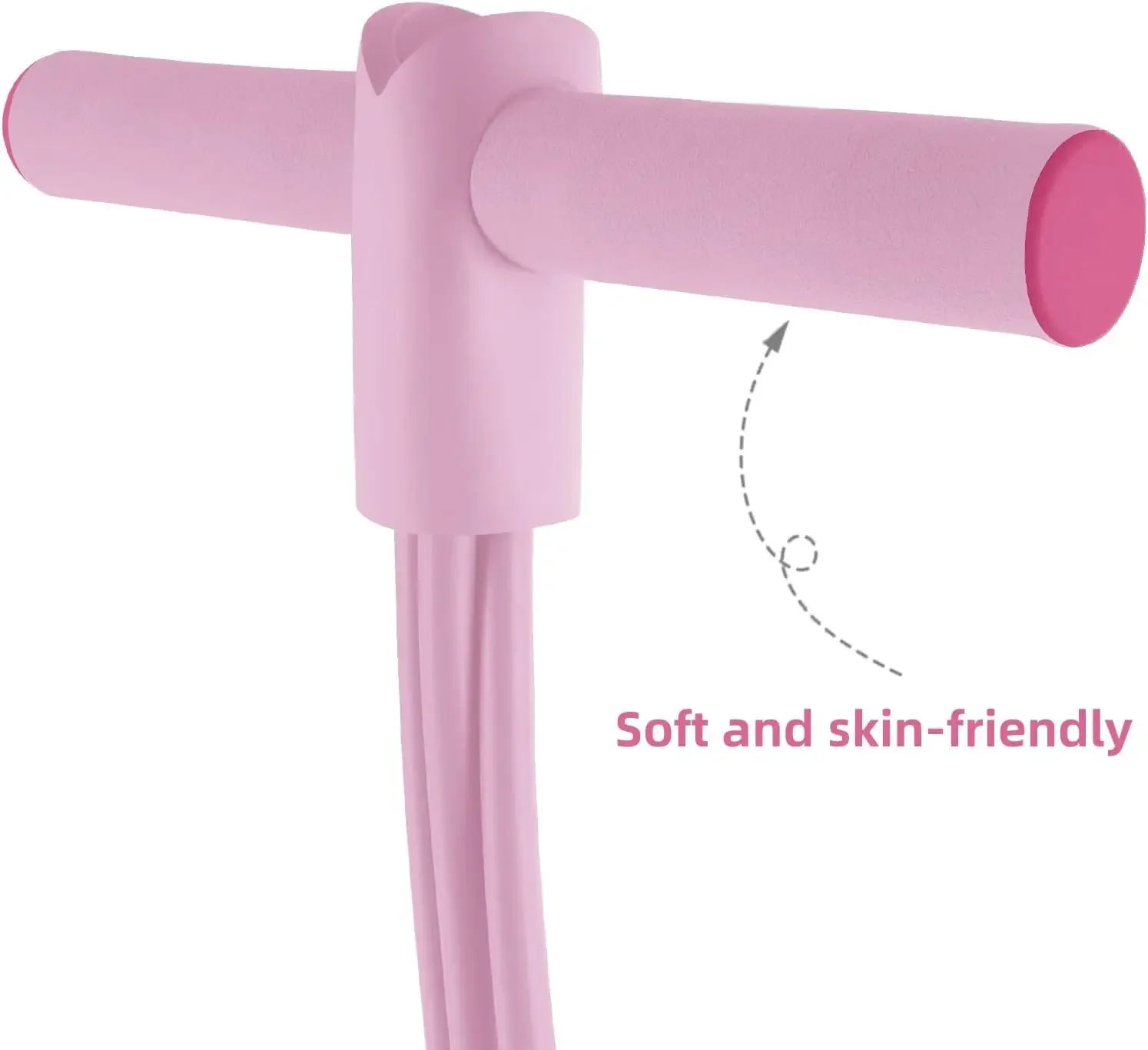
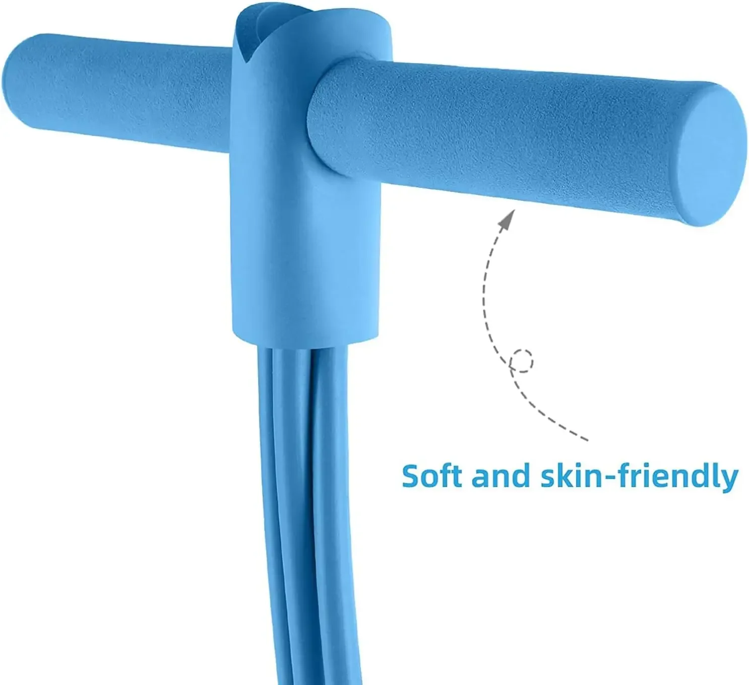
✅ Comfortable foam-covered handles for a secure, non-slip grip
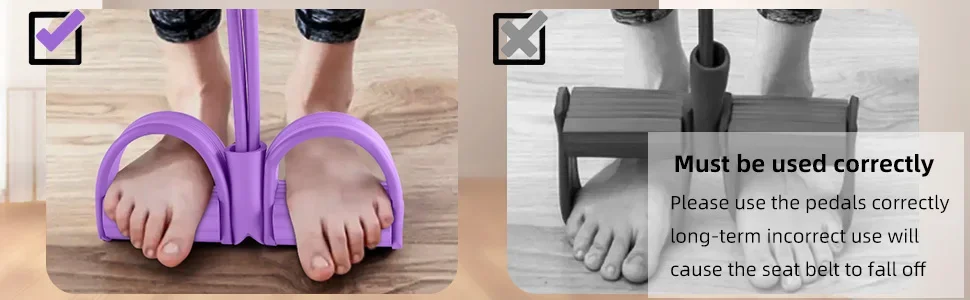
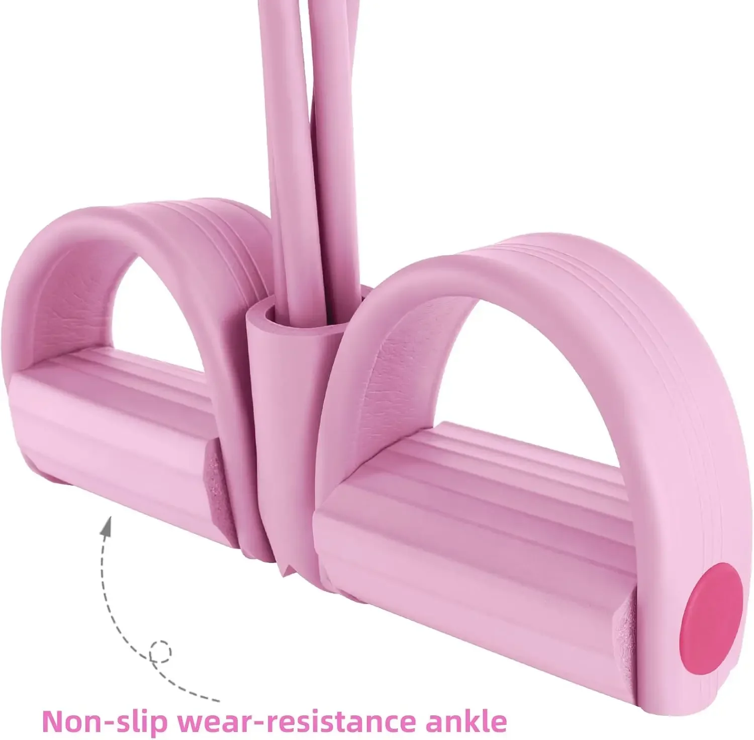
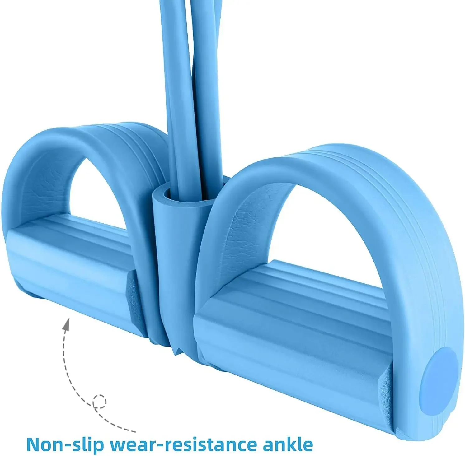
✅ Foot pedal design helps maintain stability during exercises
✅ Lightweight and portable for workouts anywhere
Perfect For
- Home workouts
- Core and abdominal training
- Strength and resistance exercises
- Stretching and flexibility routines
- Travel fitness
- Beginner to advanced fitness levels
What's Included
- 1 × FlexCore Resistance Rope Set
- Choice of 4-Tube or 6-Tube Resistance Model
Why You'll Love It
Whether you're looking to strengthen your core, improve muscle tone, or stay active on the go, the FlexCore Resistance Rope Set provides a simple and effective way to achieve a full-body workout without expensive gym equipment.
Product is final sale.
margin: 0.75em 0px 0.375em -1px;
}
width: 100%;
height: 100%;
background-repeat: no-repeat;
background-size: cover;
}.aplus-v2 .apm-brand-story-carousel-container {
position: relative;
}
.aplus-v2 .apm-brand-story-carousel-hero-container,
.aplus-v2 .apm-brand-story-carousel-hero-container > div {
position: absolute;
width: 100%;
}/*
Ensuring the carousel takes only the space it needs.
The sizes need to be set again on the absolutely positioned elements so they can take up space.
*/
.aplus-v2 .apm-brand-story-carousel-container,
.aplus-v2 .apm-brand-story-carousel-hero-container {
height: 625px;
width: 100%;
max-width: 1464px;
margin-left: auto;
margin-right: auto;
overflow: hidden;
}
.aplus-v2 .apm-brand-story-carousel-hero-container,
.aplus-v2 .apm-brand-story-carousel-hero-container > div {
height: 625px;
}.aplus-v2 .apm-brand-story-carousel.a-carousel-container {
padding: 0px;
}
/*
This centers the carousel vertically on top of the hero image container and after the logo area (125px).
Margin-top = (heroHeight - cardHeight - logoAreaHeight) / 2 + logoAreaHeight
*/
.aplus-v2 .apm-brand-story-carousel .a-carousel-row-inner {
margin-top: 149px;
}
/*
Cards need to have a width set, otherwise they default to 50px or so.
All cards must have the same width. The carousel will resize itself so all cards take the width of the largest card.
The left margin is for leaving a space between each card.
*/
.aplus-v2 .apm-brand-story-carousel .a-carousel-card {
width: 362px;
margin-left: 30px !important;
}
/* styling the navigation buttons so they are taller, flush with the sides, and have a clean white background */
.aplus-v2 .apm-brand-story-carousel .a-carousel-col.a-carousel-left,
.aplus-v2 .apm-brand-story-carousel .a-carousel-col.a-carousel-right {
padding: 0px;
}
.aplus-v2 .apm-brand-story-carousel .a-carousel-col.a-carousel-left .a-button-image,
.aplus-v2 .apm-brand-story-carousel .a-carousel-col.a-carousel-right .a-button-image {
border: none;
margin: 0px;
}
.aplus-v2 .apm-brand-story-carousel .a-carousel-col.a-carousel-left .a-button-image .a-button-inner,
.aplus-v2 .apm-brand-story-carousel .a-carousel-col.a-carousel-right .a-button-image .a-button-inner {
background: #fff;
padding: 20px 6px;
}
.aplus-v2 .apm-brand-story-carousel .a-carousel-col.a-carousel-left .a-button-image .a-button-inner {
border-radius: 0px 4px 4px 0px;
}
.aplus-v2 .apm-brand-story-carousel .a-carousel-col.a-carousel-right .a-button-image .a-button-inner {
border-radius: 4px 0px 0px 4px;
}